Ducati 900SS(h)
(h) = Heritage | The design process of getting a 70’s vibe out of a 90’s Ducati.
The Ducati 900SS is one of the most important road-going super bikes.
So that was it, Ducatis were the bikes for me, especially growing up in the era of the 916 and Carl Fogarty. Since then I’ve owned a few and crashed a few, more. But there is one machine in the Ducati stable that has always captured my imagination a little bit more than the others; the 900 Super Sport of the 70’s.
Research
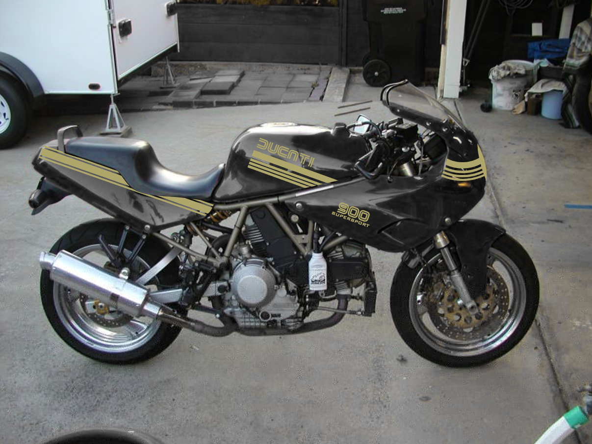
The stripes are the detail to bring it together. There are a number of different designs historically that made it to the Ducati models over the years. The use of stripes allow for a few things to happen. It allows to highlight or accentuate the model lines. It also allows for identification and branding to happen from a distance. This was something race teams did with color as well. The devil’s in the details. 😈


Emblematic
Aside from a full-faired motorcycle, the fuel tank is the largest and most traditionally recognizable spot for branding. Ducati has a rich history in its brand. Ducati Motor Holding S.p.A. established in 1926 originally founded by three brothers, Bruno, Adriano, and Marcello Ducati, who starting with radio production (horns, loudspeakers, etc.) before getting into motorcycles. I knew I wanted to go vintage… but how vintage?
1927 - Radio Brevetti Ducati
The very first logo ‘Ducati’ was created together with company’s opening in the 20s. It was fully connected with its radio activities. The logotype looked like a zipper enclosed in a circle and two crossed “wires” with Latin inscription ‘Radio Brevetti Ducati’ above it.
1935 - Ducati SSR
In 1935, the La Società Scientifica Radio Brevetti Ducati company was expanded and relocated to Borgo Panigale, the new district of Bologna. The firm’s logotype has been changed too. Now it looks like inclined letters SSR with the Ducati inscription above, and all this is placed in a circle.
1953 - Ducati Meccanica
After the Second World War, in 1953 the enterprise was divided into 2 branches – the Ducati Meccanica SpA (the producer of motorcycles) and Ducati Elettronica (engaged in releasing of components for radio). Accordingly, there was a new logo. The letter “D” on one side complemented with a laurel wreath on the other, and together they formed a circle. Two wings (directed in different sides) and Ducati Mechanica Bologna description were located above the emblem was shown on all racing motorcycles manufactured in that time. This is where I started to consider what would go on this bike.
1959 - Moto Ducati
In 1959, the enterprise, following traditions of other vehicle manufacturers, presented a new emblem illustrated on motorcycle’s tank. It looked like an eagle, the symbol of freedom. The animal carried in its claws a long pointed flag, on which the words “the Ducati Moto” was depicted.
1967 - Ducati (Wing)
In 1967, Under the influence of youth movements, Ducati decided to change the motorcycle logo. The new emblem was created for the Scrambler model. It looked like an average wing circled on a path with the Ducati italics inscription presented in the middle of it.
1975 - Ducati (Guigiaro)
In 1975, the classic variant of Ducati logo disappeared. Giorgetto Giugiaro, one of the most popular designers of that time (he became famous for the creation of Volkswagen Golf) was invited to the Ducati team for designing a new emblem. So he created an image of Ducati lettering in the normal font which was made with parallel lines. This kind of logo had been used until 1985.
Definitive colors
Color can feel like the most subjective thing you can do to any object. The choice can be completely arbitrary. I can be just a personal desire to show ones favorite color. Or, it can have historic significance to famous models of the past. An homage. It also can emote brand. This becomes a very important aspect in choosing what to do next. Colors should compliment one another, show a cohesive vision in unifying elements of the object. In this case, the fairings, the seat, the tank, the frame and wheels. They all tie together the composition and unifying vision of what you’re aiming to evoke with any project. This was very important for me. Is it race themed or historic model themed? 🤔


The choice is made
I went with the black and gold theme found on the very desirable 900SS from the 70’s.
The foundation
It all started with a ratty 1996 Ducati 900 Super Sport CR I bought on Craigslist as a daily beater to beat the traffic and parking of San Francisco, CA.
Mocking it up
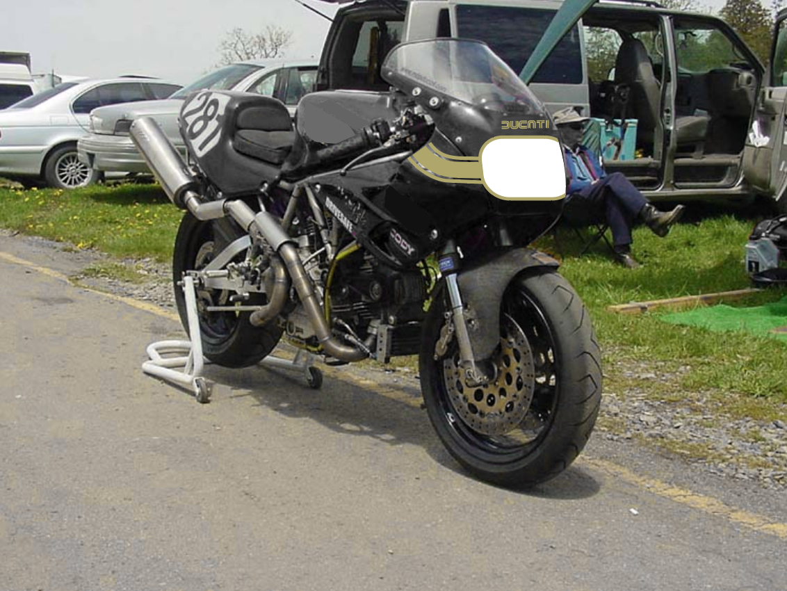
The design starts with some simple variations on stripe design. The original stripes had some variation with a thicker stripe flanked by a pinstripe or thin stripe. Bringing the vintage style to a more modern model allowed for some creative options here.


Physical mockup
To really get an accurate way the design will work a simple mockup with tape and cutouts are needed. How all the body panels line up and the ‘flow’ of the stripes are important.


Final Design
It all begins with an idea. Maybe you want to launch a business. Maybe you want to turn a hobby into something more. Or maybe you have a creative project to share with the world. Whatever it is, the way you tell your story online can make all the difference.
Dream it.
It all begins with an idea. Maybe you want to launch a business. Maybe you want to turn a hobby into something more. Or maybe you have a creative project to share with the world. Whatever it is, the way you tell your story online can make all the difference.
Build it.
It all begins with an idea. Maybe you want to launch a business. Maybe you want to turn a hobby into something more. Or maybe you have a creative project to share with the world. Whatever it is, the way you tell your story online can make all the difference.


